The Facebook World
Tuesday, 14 December 2010 | by Pat's Picks
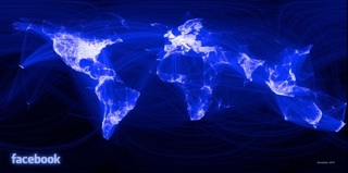
I’ve always loved maps. I love locating countries and cities that I’ve visited and those that I intend to in the future. A Facebook intern has taken it step farther and created a new map based on something much more topical than the distribution of population or forests—it’s based on the distribution Facebook friends. I first read about the project on Gawker, which says intern Paul Butler used data from 10 million of the site’s friendships to create his map.
I agree with Gawker that one of the most interesting things the map illustrates is not what areas have the highest concentration of Facebook users but rather regions—like China and much of Africa—that are virtually untouched by the social media juggernaut.
Click the image for a bigger view. Click here for an explanation of the project.
